Last time, I talked about how Amazon and Google famously keep hamburger menus on their mobile apps as opposed to the popular bottom navigation bars. Well, Gmail and the main Amazon app have made some changes and gained navigation bars since then so I wanted to talk about those changes and postulate on the intended steps there, and how it has affected the users.
Into the void from my personal website with it's 5 users a month that is (speaking of- hello and thanks for reading dear recruiter or UX student on page 14 of Google results trying to find the right article on navigation bars!)
So without further ado, let's take a look at how the 2 giants have taken to navigation bars!
Amazon
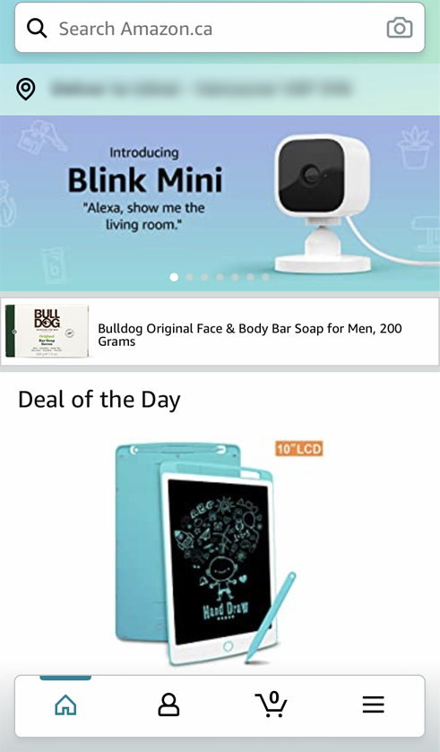
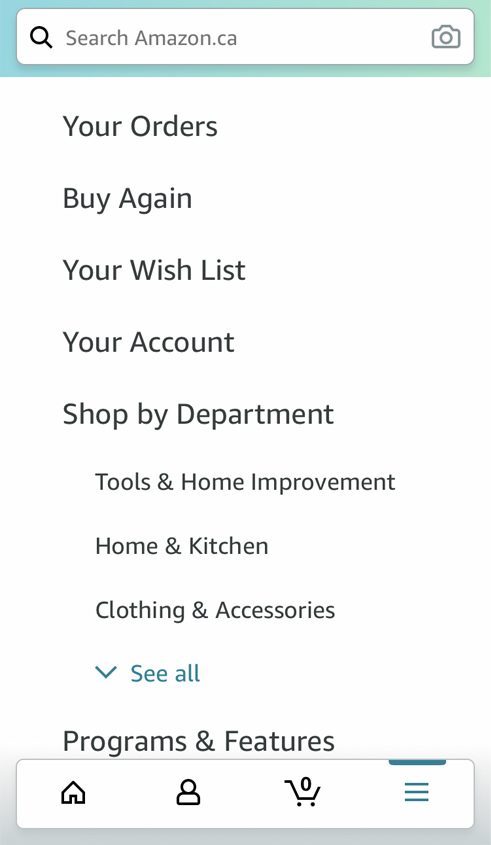
Now, the Amazon app's change is the most drastic, as they have taken everything off the top navigation bar and left that space exclusively for their search bar. Instead, they moved down "Home" "Cart" "Profile" and their old Hamburger menu unhindered and intact as a navigation bar at the bottom. That particular nav bar in that particular order (if we replace "hamburger menu" with "settings", or rather, all the stuff-we-don't-know-how-to-categorize-so-we'll-stuff-it-here-Monica-style) is standard for mobile apps, so it's clear that Amazon is aiming for a ubiquitous approach in this redesign.

I'm quite honestly torn. On the one hand, I am all for sensible ubiquity in UI design. If the design is usable and intuitive, and it's used all over- that means we're moving to a place where users can enjoy having a seamless experience regardless of which device or app they're used to using. The fact that Amazon is using bottom navigational bars (a beautiful, intuitive element usable by even those of us with small tiny hands) is a giant step in that direction given Amazon's massive number of daily users. Good for their design team.

However, as a long time Amazon app user, what trips me up about this redesign is that the usual conceptual model for apps with bottom nav bars and the amazon app doesn't quite match up. The hamburger menu stuff is still, as I mentioned, untouched and moved to the bottom right corner. I'd guess they're trying to slowly move things and get their users used to the changes, but if I used the amazon app like I use my Etsy app, I'd expect the categories near the top bar, and I'd expect everything about my account and my wish list to be on tab #3- some of which are there as duplicates.
I guess I feel like this change was intended to be a bold step forward that wasn't a full step into the bottom-nav-bar club. A well-meaning move, but I feel that it's half-heartedness leaves a lot of users confused. I also wonder what they are planning for their desktop website, which the app has mirrored for so long, and which has remained unchanged. If they plan to move around the hamburger menu contents to match other apps, then their long-held conceptual model is thrown off. I'm slightly befuddled by this change, but I'm excited and curious to see what further changes Amazon is planning.
Gmail
Now, although the Gmail change wasn't nearly as drastic, it's a lot more bewildering.

Why god, why?
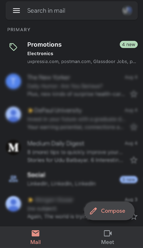
If the Amazon app was trying to follow everyone's cue, then Google simply ignores it, and uses the spatial opportunity to... experiment with an upsell I suppose?

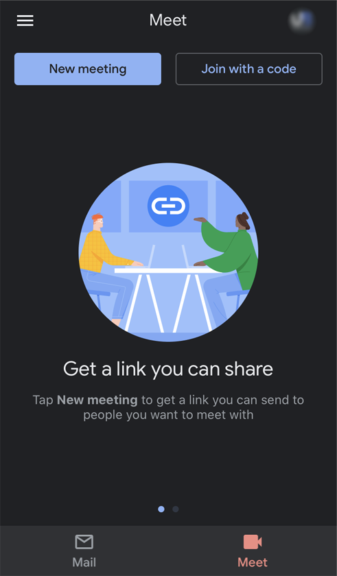
When Zoom became a popular video-conferencing option amidst the pandemic, Google, not to be beat. came up with Meet- their own video conferencing app. Not having had much traction and cursed with the bad luck they dealt with Hangout and Duo, my best guess is that this inclusion is a way to piggyback on Gmail.
I don't have issue with the piggybacking though- Google has done the same with Hangout on desktop- adding the chat to a bottom left corner. My issue is with the placement of Meet, and how it affects the app UI.
Bottom nav bars have been used to divide the app into different top-level navigational spaces. By putting "Mail" and "Meet" there where it is, that's what the app is effectively divided into.
Which, again would be fine, if "Meet" had been integrated thoughtfully. There's no new feature to connect Gmail and Meet, and no link between the two except what Google hopes would be there. For something that conceptually takes up half of the app's space, Meet does not rise to match it's spatial importance.
I'm guessing (and please don't take my guesses as gospel, dear one of five readers) that Google wanted to avoid users needing to download Meet (after Duo and Hangout, who can blame them?) and skip straight to a pasted-on integration.
I'm not trying to rag on Google- I'm simply baffled by a very abrupt and unnecessary and confusing plastered on feature, in light of their track record of considerate, beautiful and intuitive integrations and design changes. I would call this change an experiment that I hope is impermanent.
Conclusion
Yes, in my last article I said that Google and Amazon can get away with Hamburger menus and a certain conceptual model- but it's somewhat comforting to see two of the FAANG join everyone else, and flirt with ubiquitous design elements and conceptual models.