IFN Modern Site Navigation Proposal
Overview
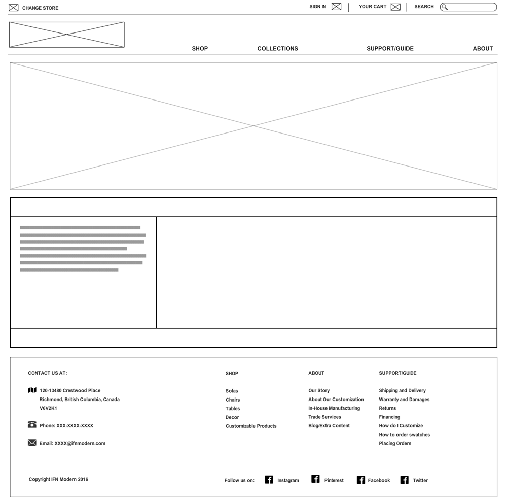
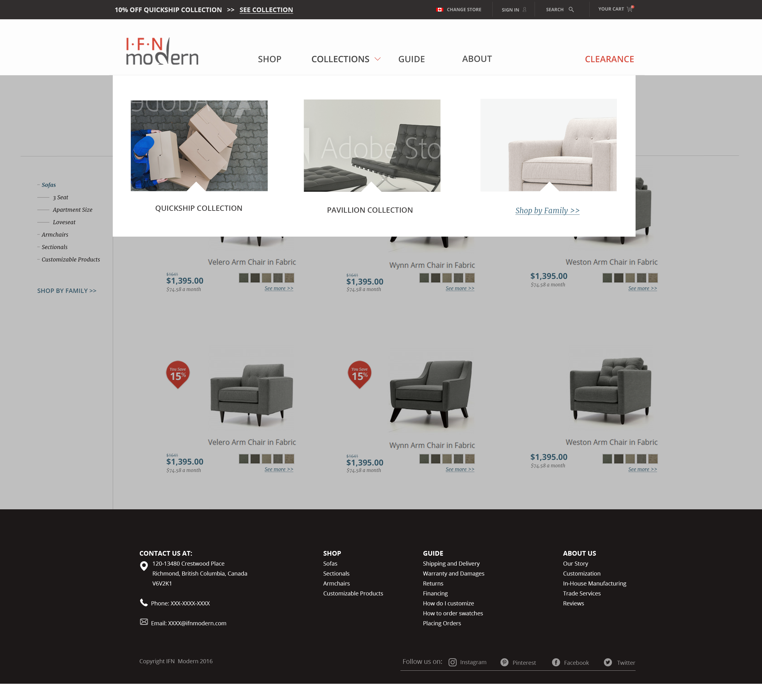
IFN Modern was a mid-century modern ecommerce website. We were in process of creating a new website, and I was asked to present a new site navigation proposal. We had just redefined our brand identity, so using that, and some competitive analysis, I created wireframes for the new site.
Click here to jump to the mockup!
Main Objectives
Matching the brand identity
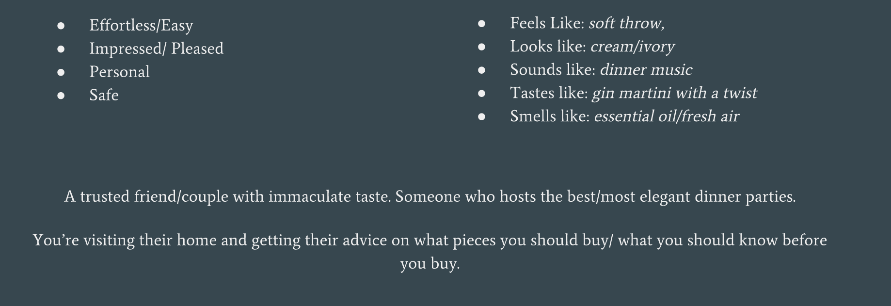
Our social media coordinator and brand manager created a brand personality. Our goal was to create a site navigation/webstie that correlated with it's "voice".
Encouraging Exploration
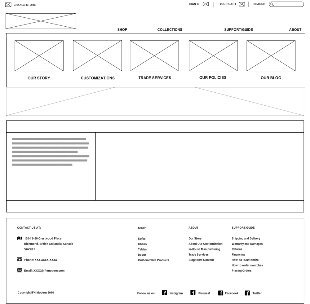
Although we had many return visitors, we still had a high bounce rate. We needed to incentivise our users to stay, and keep the ones who stay and explore feel more at ease with our site and our brand. We had already decided to include inbound marketing materials (how to guides and blogs), and my job was to figure out how to implement it.
Initial Research
Competitive Analysis
I looked into some competing furniture ecommerce stores, as well as successful and intriguing ecommerce sites.
Session Recordings and Heatmaps
We used fullstory to take a focused look at where the users were navigating after the initial landing page. If not the products page, then what other information were they looking for? What was the drop-off point?
Project Insights
Help Sections alleviate logistical nightmares
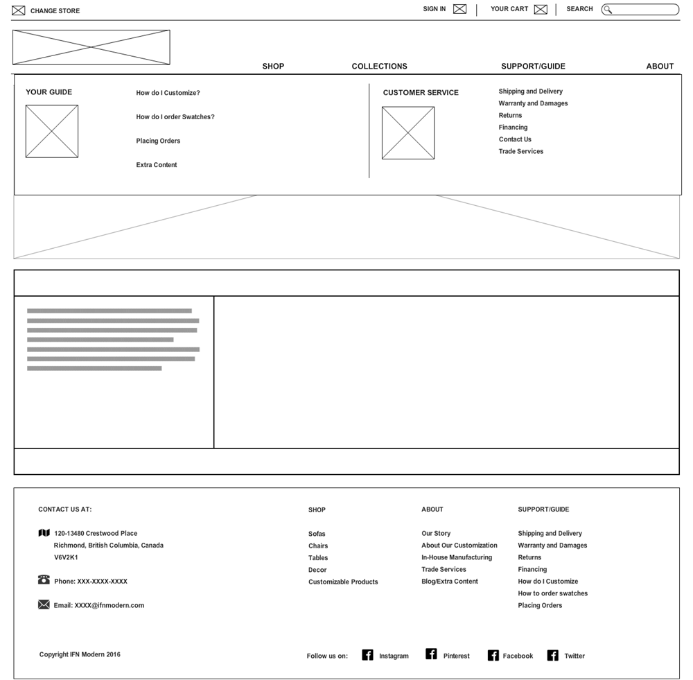
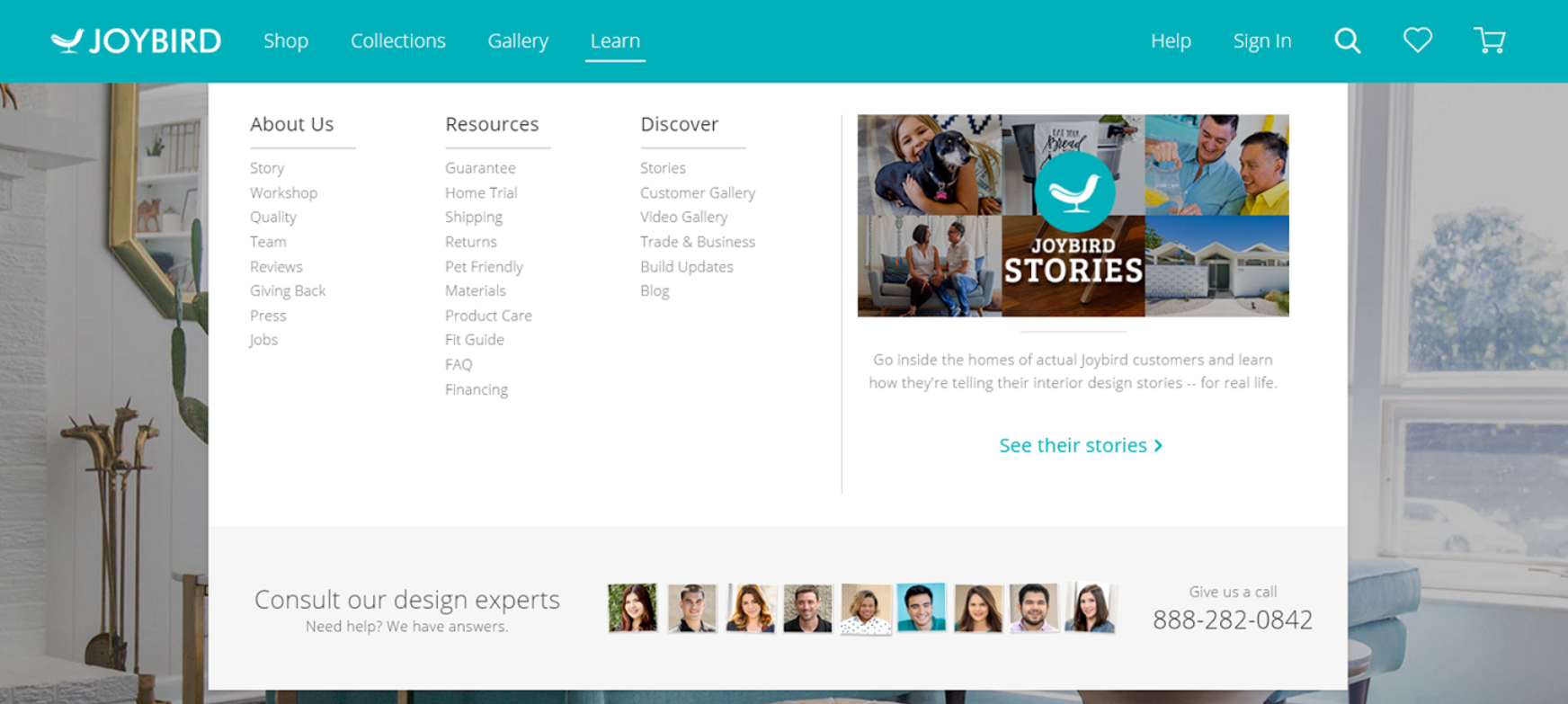
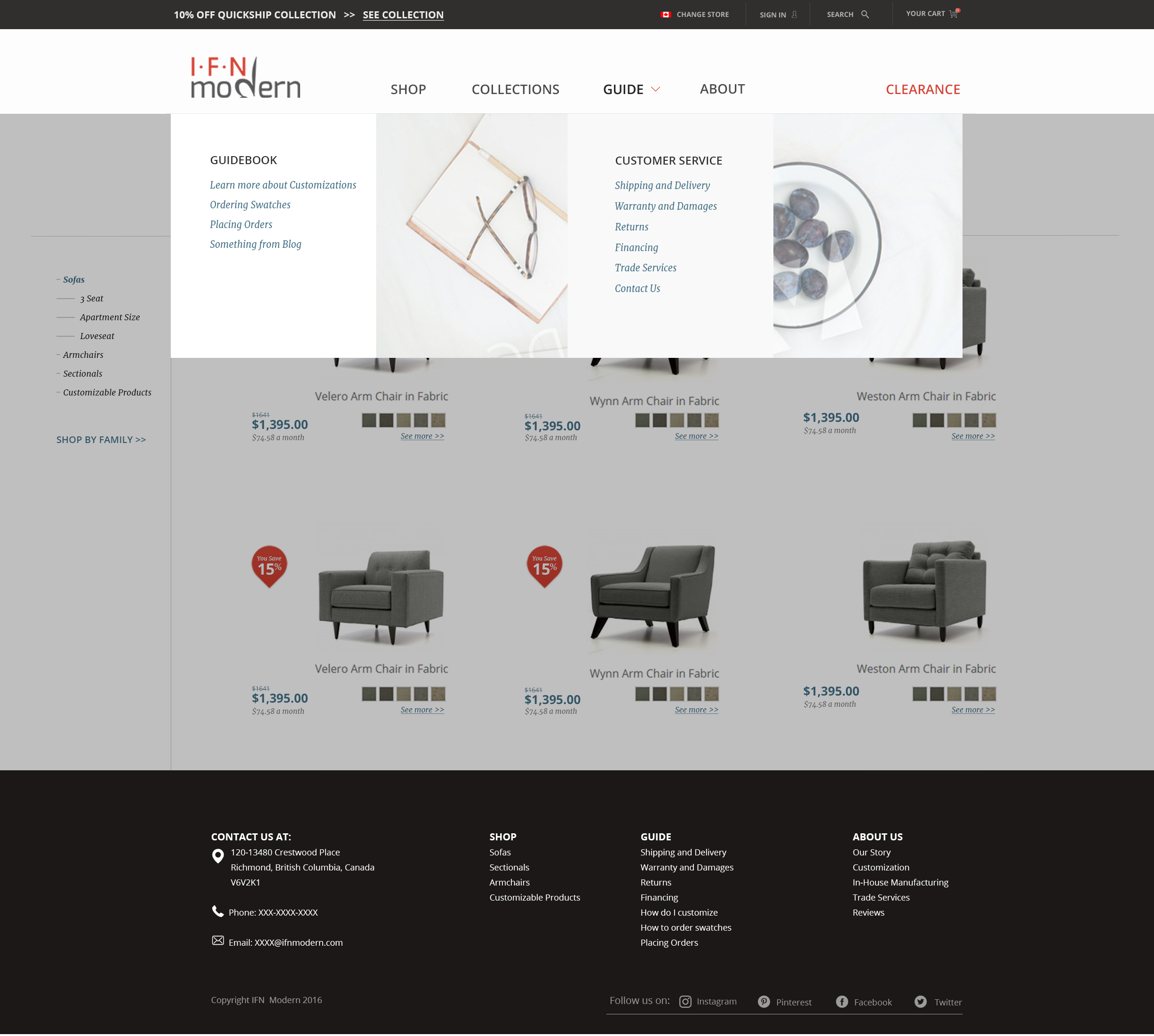
Once a user has started to ease into a website, they FIRST want to know if delivery and shippipng is viable. Figuring out delivery rates, times, cancellations and refunds takes more time, research and consideration- so it was important that we focused on making navigating through this information as easy as possible. One solution that I found was interesting was having a large help section with sub-menus, which I found made navigating much easier.

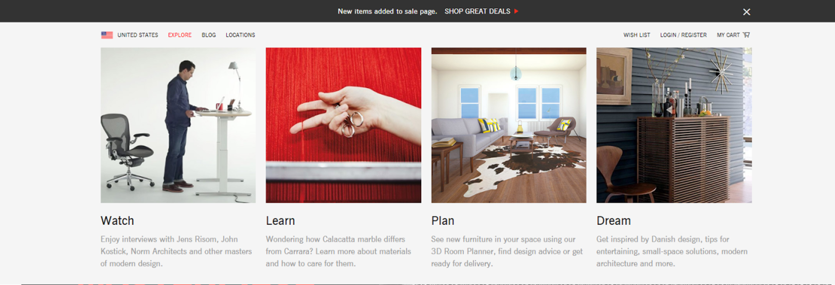
Megamenus- in this case more is more
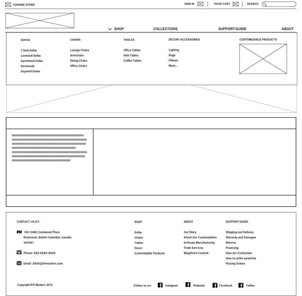
A large purchase online is a gamble. The bigger the purchase, the more the user will spend time on research. We found that return users often took between 3 weeks to 6 months returning to our site (and probably many others) trying to gauge the company, and explored the site. For this type of exploration, I found that sites used "Megamenus" as a visually appealing way to open up the site to as much exploration from one place (that being the menu).

Tying FAQs to blog articles
All of the best ecommerce stores had "guide" or "discovery" sections with lifestyle blog articles. One thing I noticed with competing furniture stores was that their extra content and articles were derived from much of the same frequently asked questions we got. It therefore made sense to point the users to a "guide" section with blogs that would answer all of these questions.
IDEATION: Sitemap for headers and footers


IDEATION: Wireframes
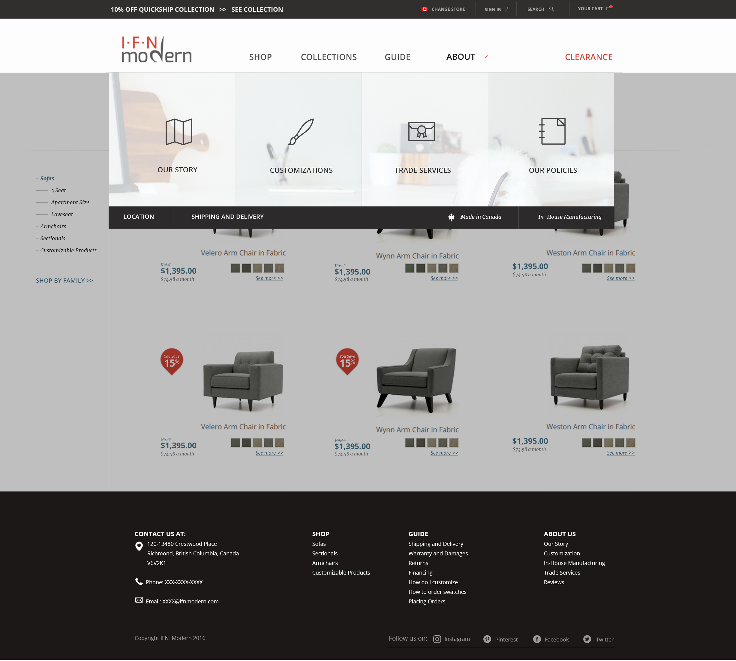

IDEATION: Mockups
